Monday, May 30, 2016

12 Tags of 2015 - May

Paper flowers, tissue paper, die cutting machine, rubber stamp, matte gel, ribbon, distress ink pads, glimmer mist, gold foil, modelling paste, etc, etc.
All mixed together and there was a tag:))

Based on Tim's technique for the month May.


Beginner Flip Book #3 - International

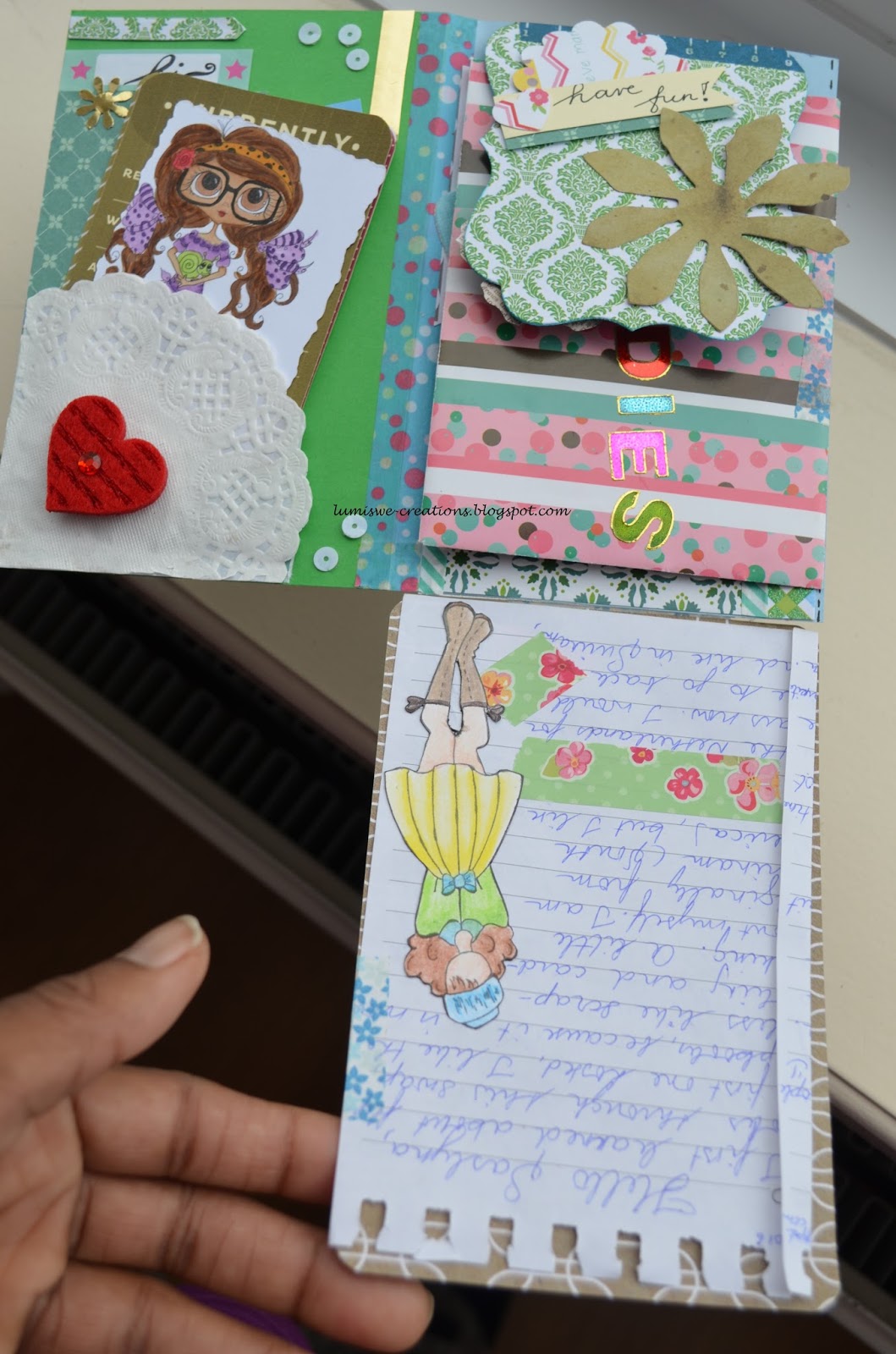
I made another pen pal flip book using green and blue. There are lots of embellishment in this flip book. I also made a lot of the tag using scrap paper.


I used my We r memory makers envelope board for the little grey envelope. I received the pink striped envelope on the left in a swap, so I re-use it here.


This is a journal card I once received from a swapper.


The flip book with the goodies in the pockets.


A bestie digital image coloured with copic markers.


Digital journal tags, printed at home.


Some of the goodies, which will go in the pockets. The small grey envelopes has little tags in it.


The back of the flip book.

Monday, May 16, 2016

Art journal page with dolls #5 ~ Illusions!

Another art journal page with dolls. I coloured this doll years ago with copic markers. She is a digital image from Penny Blossom. For this art journal page I took it from my collection of coloured images, because dreamy look:) What did I used on this page? Dr. Martin India inks, white gel pen, designer paper, .... , rubber stamp and a multi liner (black).

I coloured the base on watercolour card stock. In the past I cut two seahorses out on this watercolour card stock using the Create a critter cartridge for a project. The first one wasn't a success, because it cut into the card stock, but it did not cut through. So there is a kind of cut or embossing on the watercolour card stock. I used it as a shadow seahorse on this page and drew an eye, dots and stripes on it. For the seahorse that was cut out I used designer paper to back it up, drew an eye and dots to outline it. This way I used this piece of watercolour card stock with cut outs in a very good way.

A very nice imaginary page, isn't it? I love it!
Thank you for stopping by:-)


Handmade card creme and blue

These colours do let me think of a masculine card. That is why this time I wanted the card to be more feminine. After finishing the card I do think I succeeded;)


Ingredients:
die cuts (oval)
rubber stamp
Stampin' Up ink pad ~ night of navy
acrylic stamp
embossing powder ~ holographic

Art journal page Juli N. Prima doll #9

The theme for this art journal page is romantic. I didn't want to work with the colours red or pink. I went for different colours and still make the page have a romantic look. I don't know if I succeeded; red or pink for romantic themes seems so normal. I know it isn't. Sometimes I really think the page has a romantic look. I love the background especially the bister and the stencil.


Ingredients:
H2O
bister ~ yellow
water
stencil
prisma color watercolor pencil
copic marker spica gelpen ~ yellow, grey
Whiff of joy rubber stamp
paper punch ~ heart
paper flowers
Close to my heart ink pad ~ archival black
Close to my heart ink pad ~ blush
gem

Sunday, May 15, 2016

Greeting card sender's choice

A quite simple card made with die cuts for the hexagon. The base for the greeting is hand cut and the greeting is a rubber stamp from Rubbernecker. I also added three flower gems as a finishing touch. To make a matching envelope I used an acrylic flower stamp.